Remote observations show patterns, while practical decisions depend on explaining what those patterns could mean. Interpretation therefore requires more than locating a high or low value on a map. A useful analysis considers the timing of the observation, the physical processes that influence the measurement, and the information available from complementary sources. This perspective separates an observed signal from a proposed explanation and from an action recommended to a user. Keeping those stages distinct makes it easier to investigate alternative causes, communicate ambiguity, and choose a proportionate next step.
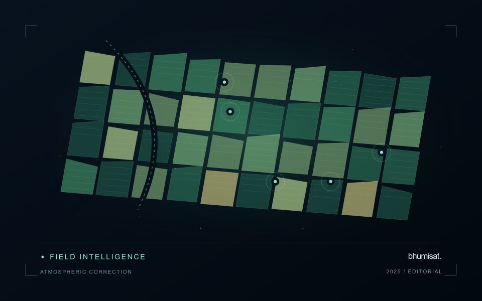
This working guide considers spectral band alignment and common grids in maize production fields. The immediate decision is to prioritise uneven-development scouting. Useful reference evidence includes emergence dates, plant stand notes and field stage. The case is an illustrative planning context, with assumptions to check against the actual sensor, landscape and project requirements.
A multiband value should refer to the same ground
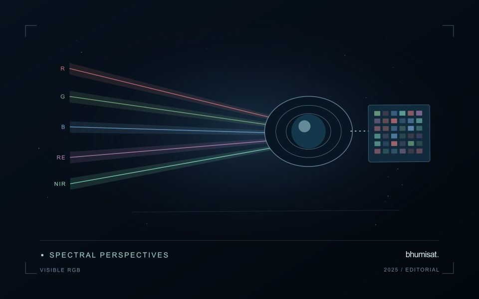
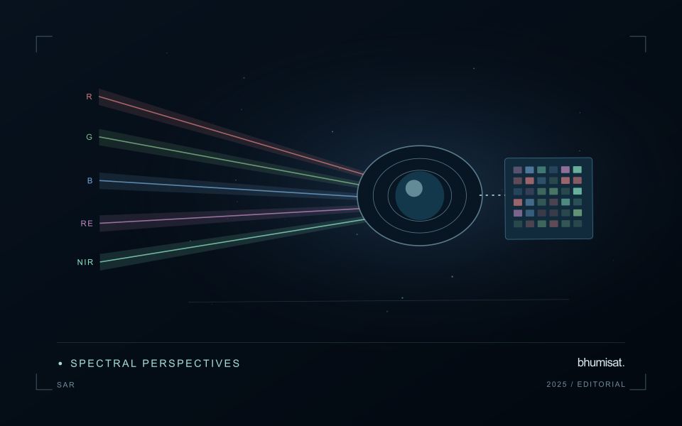
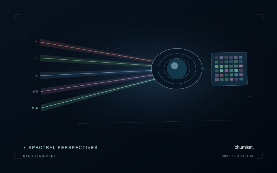
A multispectral analysis combines information from several channels, so their geographic relationship matters. If the channels are displaced, a calculation near a field boundary may combine vegetation in one band with a path, ditch or neighbouring surface in another. The resulting pattern can look like a meaningful spectral difference even though it is partly an alignment artefact. A workflow should therefore consider band alignment before producing indices, classifications or crop parameter estimates, particularly when the target landscape contains small fields and sharp transitions.
Alignment is not the same as assigning every band the same pixel dimensions. Bands may have different native sampling and observation characteristics. Resampling them onto one grid creates a shared representation, but it does not make all channels contain the same original spatial detail. The selected interpolation method can change values around edges and influence derived statistics. Record the target grid, coordinate reference system, pixel alignment and resampling choices so that another analyst can reproduce the combination and evaluate its consequences.
Assess the effects of resampling
Check alignment using features that can be recognised reliably in the relevant channels and are stable at the time of acquisition. Inspect several parts of the area rather than relying on one visually convenient location. A displacement may vary across the image or become more obvious in particular terrain. Quantitative checks should use suitable independent references and report the scale of the remaining error. A correction that appears convincing on a broad overview still needs examination at the spatial scale used by the application.
When evaluating an agricultural model, test whether alignment sensitivity changes its result. For example, compare field statistics with and without a documented interior boundary exclusion, or examine the effects of a small plausible displacement. Such checks help reveal whether a conclusion depends mainly on edge pixels. Avoid using repeated interpolation steps where one controlled transformation would suffice. A clear geometric processing chain makes spectral combinations more defensible and helps ensure that a reported crop difference reflects observations of comparable ground rather than a hidden mismatch between image channels.
The setting: Maize production fields
Maize fields can differ in emergence date, variety, plant density and management even within the same growing region. An image comparison is more meaningful when those differences are recorded. Early in the cycle, visible soil and row arrangement can influence a field summary substantially. Later, the canopy may become dense enough that some vegetation measures respond less clearly to additional growth. Interpret the observations in relation to the crop stage and the variable of interest.
Construct a field timeline that marks establishment, important field operations and the dates of usable observations. A decline or delayed increase in a signal can suggest a place to investigate, but several explanations may be possible. Soil conditions, weeds, storm effects and crop timing can produce patterns that require field context. Avoid turning a general anomaly map into a specific diagnosis without measurements that distinguish between these alternatives.
A scouting plan should include representative normal areas as well as the locations ranked most unusual. Record crop stage, stand continuity, visible damage and management information consistently. Production models require their own training and evaluation data, ideally covering different fields and seasons. For operational use, assess whether a satellite-derived priority list helps the field team find relevant conditions efficiently, and report the observation age whenever weather leaves a gap in the current image sequence.
Maintain the geographic units of analysis
Many observation services summarise measurements within a field, management block, catchment, forest unit, or other mapped boundary. The meaning of that summary depends on whether the boundary accurately represents the unit being discussed. Start with a clear source for the geometry and record its date, coordinate reference, and intended use. A boundary drawn for visual orientation may require additional checking before it becomes a measurement unit.
Inspect overlaps, gaps, narrow fragments, and features that may have changed since mapping. A geometrically valid polygon can still describe an outdated operational unit. Ask the responsible team how divisions, mergers, new infrastructure, and management changes are recorded. Where pixels or reference measurements cross a boundary, define how they are assigned or excluded so that results remain comparable between analysts and processing runs.
Version the boundaries alongside the observations. If a unit changes, preserve a relationship between the previous and revised geometry rather than replacing the history without explanation. Comparisons through time should identify whether they use a constant spatial unit or the operational units valid at each date. This makes it easier to distinguish a change in the measured surface from a change introduced by the geography used to summarise it.
Deliver quality flags that users can interpret
Quality information should describe the condition of an observation in terms that remain useful through the workflow. A single valid or invalid label may be sufficient for some calculations, but operational users often need to know why an observation was qualified. Distinguish acquisition limitations, processing failures, uncertain reference matches, and conditions that make interpretation ambiguous. These categories point towards different responses and should not be merged without a clear purpose.
Define a small, documented set of flags with stable meanings. Record whether a flag applies to a complete scene, a geographic unit, an individual measurement, or a derived result. A unit containing a mixture of qualified and unqualified observations may also require a coverage measure. Include the rule used to combine flags when summarising data so that a favourable average does not conceal a substantial fraction of unusable input.
Test the flags with the people receiving the product. Ask what they would do differently for each state and whether the terminology supports that choice. Keep the original flags available even if the interface presents a simpler summary. When flag definitions change, version the rules and review their effects on historical comparisons. Useful quality communication makes the condition of the evidence visible at the moment when a user decides how much confidence to place in the result.
Bring the evidence back to the decision
A strong interpretation states what was observed, which explanations remain plausible, and what additional evidence would help distinguish them. Avoid presenting a convenient label as a confirmed cause when the measurements support only a broader pattern. Connect the proposed next step to the significance of the decision and the confidence available. This creates an interpretation that a field team, analyst, or project partner can examine, challenge, and improve as further observations become available.
Sources & further reading
Explore the bhumisat spacecraft concept and our vision towards 2030, or return to the journal.