Remote observations show patterns, while practical decisions depend on explaining what those patterns could mean. Interpretation therefore requires more than locating a high or low value on a map. A useful analysis considers the timing of the observation, the physical processes that influence the measurement, and the information available from complementary sources. This perspective separates an observed signal from a proposed explanation and from an action recommended to a user. Keeping those stages distinct makes it easier to investigate alternative causes, communicate ambiguity, and choose a proportionate next step.
This working guide considers rgb satellite imagery for field interpretation within urban green-space mosaics. The immediate decision is to select green-space locations for assessment. Useful reference evidence includes canopy cover, surface context and appropriately timed measurements. The case is an illustrative planning context, with assumptions to check against the actual sensor, landscape and project requirements.
The setting: Urban green-space mosaics
Urban green spaces form mosaics of trees, grass, bare ground, paths, buildings and water. The observation needed depends on whether the project concerns vegetation cover, land-surface temperature or a particular use of the space. These are distinct variables. Visible and near-infrared imagery can describe vegetation-related patterns, while a temperature study requires suitable thermal measurements and an interpretation that respects what those measurements represent rather than treating greenness as a temperature sensor.
Define park or management boundaries and inspect how surrounding urban surfaces contribute to each observation. Shade, seasonal foliage and maintenance can affect vegetation comparisons, while acquisition timing matters strongly to a thermal interpretation. Data from different instruments may also have different spatial support. A fine-looking display should not suggest that a coarse thermal measurement resolves the same detail as an optical image or an individual tree inventory.
Field validation should record the target variable with methods and timing suited to the intended claim. Canopy observations, surface measurements and information about how people use a site provide different evidence streams. A remotely observed pattern may help choose assessment locations without establishing a complete account of human exposure or park performance. Evaluate the specific management decision, and communicate the scale, observation time and uncertainty that determine how the resulting map can be used.
Use visible context carefully
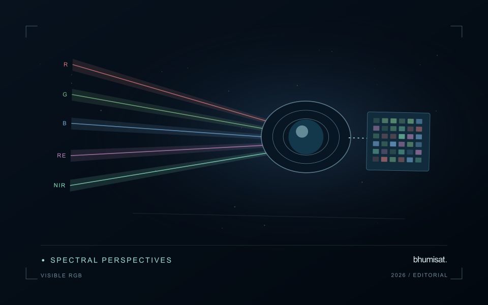
A familiar colour image combines red, green and blue measurements into a display that resembles human visual experience. That familiarity helps people recognise fields, roads, exposed soil, water and settlement patterns. It can also create a false sense that interpretation is effortless. Satellite imagery is influenced by acquisition conditions, processing and display choices. The image may not show the same colours an observer would have seen from the ground. Its value lies in spatial context, supported by a clear account of how the display was produced.
Contrast stretching makes subtle patterns easier to see, but it can make two dates look different even when the underlying reflectance is similar. An automatic stretch selected separately for each image is useful for exploration and less suitable as evidence of a measured change. Keep acquisition dates visible and distinguish a display adjustment from an analytical transformation. When comparing scenes, use a consistent viewing approach and inspect the original values or a suitable quantitative product before drawing a conclusion from colour alone.
Prepare a repeatable visual review
Visible imagery supports a practical first review of a monitoring result. Check whether a field boundary follows the current cultivated area and whether paths, buildings or neighbouring vegetation are included accidentally. Look for management changes that may explain a spectral anomaly, such as harvest, replanting or newly exposed ground. A visual check can identify a plausible explanation and guide field inspection. It should not be presented as proof of a specific disease, nutrient deficiency or production outcome without evidence suited to that claim.
A repeatable review protocol records what the analyst examined and how confidently it could be interpreted. The record can include cloud and shadow presence, obvious mapping errors, the age of the image and any feature requiring confirmation. Use agreed descriptions so that different reviewers can compare their findings. Where a detail is smaller than the available spatial information, acknowledge that limitation and seek a complementary observation. RGB imagery is a useful interface between technical analysis and field knowledge when its visual clarity is accompanied by disciplined interpretation.
Budget the complete processing workflow
A processing budget should cover the complete path from source observations to a maintained product. Data access and computing are only part of that path. Include preparation, geographic updates, reference collection, expert review, delivery, and support where those activities belong to the service. A calculation that runs cheaply on a small demonstration can still require substantial effort when the surrounding work is repeated across many locations.
Measure representative tasks rather than assuming that every observation costs the same amount to process. Record data volume, processing time, retry frequency, manual interventions, and the conditions that create unusually demanding cases. Separate fixed setup work from work that grows with the number of observations or users. These records support decisions about batching, caching, storage policy, and the point at which a different processing design becomes worthwhile.
Connect the budget to a defined level of service. Faster delivery, more frequent observation, broader coverage, or more detailed review can each change the resources required. Describe these trade-offs before promising a delivery pattern that the workflow has not demonstrated. Review the budget using operational evidence and preserve enough detail to understand changes between processing versions. The aim is a sustainable service whose resource choices remain aligned with the information that users value.
Prioritise alerts using evidence and consequence
An alert is a request for attention, so its design should consider both the evidence available and the cost of responding. Begin by distinguishing a measured change, a proposed interpretation, and the action expected from the recipient. A large numerical difference is not automatically the most urgent case. The significance of the location, the age of the observation, the confidence in the interpretation, and the consequences of delay can all influence priority.
Create a review queue with enough context to support consistent decisions. Useful information can include the supporting dates, quality qualifications, previous observations, geographic unit, and the reason the case entered the queue. Define when an alert can be closed, escalated, or held for another observation. A documented rule is easier to improve than an informal practice that depends entirely on the memory of the operator reviewing the result.
Collect feedback from inspections and operational responses. Record alerts that led to a useful finding, alerts that required no action, and important conditions that the system failed to flag. Review these outcomes across different settings rather than relying only on a total count of alerts. The objective is a queue that directs limited attention towards meaningful decisions, while generating evidence for adjusting thresholds, improving context, and reducing repeated sources of unnecessary work.
Bring the evidence back to the decision
A strong interpretation states what was observed, which explanations remain plausible, and what additional evidence would help distinguish them. Avoid presenting a convenient label as a confirmed cause when the measurements support only a broader pattern. Connect the proposed next step to the significance of the decision and the confidence available. This creates an interpretation that a field team, analyst, or project partner can examine, challenge, and improve as further observations become available.
Sources & further reading
Explore the bhumisat spacecraft concept and our vision towards 2030, or return to the journal.