Every observation and interpretation contains uncertainty, but the sources and consequences of that uncertainty differ between applications. Some arise from acquisition conditions, others from reference measurements, processing choices, or the transfer of a model to a new setting. This perspective examines how those sources affect the decision a user is considering. It encourages teams to describe uncertainty in a form that can influence action, rather than adding a generic qualification at the end of a report. The objective is to support proportionate decisions while keeping the limits of the available evidence understandable.
This working guide considers satellite time series and crop phenology across periurban land transitions. The immediate decision is to review changing land-use boundaries. Useful reference evidence includes dated land-use observations and parcel-level reference records. The case is an illustrative planning context, with assumptions to check against the actual sensor, landscape and project requirements.
The setting: Periurban land transitions
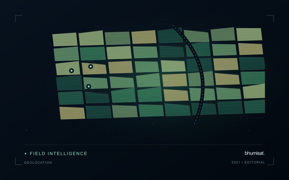
A periurban landscape can contain agricultural fields, new buildings, open construction areas, roads and vegetation in close proximity. Changes may occur in small patches and follow different stages of development. A monitoring system should define whether it is mapping surface cover, documenting a change in land use or prioritising locations for a site review. These tasks are related, but a bare surface in an image does not automatically establish its eventual use.
Maintain parcel or management boundaries where they are relevant and review whether the image resolution can separate the features of interest. Small geometric offsets can alter a comparison along narrow roads or building edges. Seasonal crop changes, temporary clearing and construction activity may produce different explanations for similar spectral patterns. Retain the acquisition dates and quality context, particularly when the available observations leave uncertainty about when a transition occurred.
Field validation should identify the current surface and its documented use as separate attributes. Record the location, date and spatial extent represented by each observation, and include unchanged parcels as well as obvious transitions. A useful product provides an auditable inventory of observed changes and their uncertainty. More specific conclusions about development status, ownership or future use require appropriate external records rather than inference from image appearance alone.
Describe a seasonal trajectory
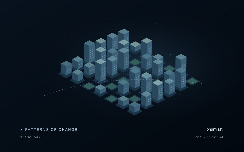
Phenology concerns the timing of recurring biological development. In an agricultural image series, a changing canopy can create a trajectory associated with establishment, growth, maturity and harvest. The trajectory is an indirect observation of those processes. Satellite measurements do not necessarily identify each agronomic stage on their own. A useful interpretation connects the series with crop type, planting information and field observations. This helps distinguish an unexpected development pattern from a normal difference in variety, management or seasonal timing.
The first design choice is the unit of comparison. A management block, planting cohort or crop zone may provide a more meaningful series than a broad administrative area containing several crops. Keep the spatial unit consistent and track changes to its boundary. Record which summary statistic is used and how many valid observations support it. A smooth line can be visually persuasive even when it connects only a few reliable dates. The chart should make gaps and uncertain periods visible instead of implying continuous knowledge.
Evaluate timing and missing observations
Timing metrics require explicit definitions. The date of a measured increase, the date inferred from a fitted curve and the date recorded by a field team may differ. Decide which quantity is needed and how it will be evaluated. Smoothing can reduce noise, but an overly flexible or overly rigid method can alter the apparent timing of an event. Compare candidate settings against independent observations and inspect whether they behave sensibly during short seasons, interrupted growth and abrupt management changes.
A practical monitoring service also needs a policy for delayed and missing data. Optical cloud cover can obscure a critical part of a season, and a later observation may only confirm that a transition occurred within an interval. Report that interval where appropriate. Do not replace an unavailable observation with an unlabelled estimate. Over several seasons, evaluate whether the derived timing information improves planning or interpretation and whether the relationship remains stable. The goal is a defensible seasonal description that supports a field decision, with its temporal uncertainty retained.
Prioritise alerts using evidence and consequence
An alert is a request for attention, so its design should consider both the evidence available and the cost of responding. Begin by distinguishing a measured change, a proposed interpretation, and the action expected from the recipient. A large numerical difference is not automatically the most urgent case. The significance of the location, the age of the observation, the confidence in the interpretation, and the consequences of delay can all influence priority.
Create a review queue with enough context to support consistent decisions. Useful information can include the supporting dates, quality qualifications, previous observations, geographic unit, and the reason the case entered the queue. Define when an alert can be closed, escalated, or held for another observation. A documented rule is easier to improve than an informal practice that depends entirely on the memory of the operator reviewing the result.
Collect feedback from inspections and operational responses. Record alerts that led to a useful finding, alerts that required no action, and important conditions that the system failed to flag. Review these outcomes across different settings rather than relying only on a total count of alerts. The objective is a queue that directs limited attention towards meaningful decisions, while generating evidence for adjusting thresholds, improving context, and reducing repeated sources of unnecessary work.
Deliver quality flags that users can interpret
Quality information should describe the condition of an observation in terms that remain useful through the workflow. A single valid or invalid label may be sufficient for some calculations, but operational users often need to know why an observation was qualified. Distinguish acquisition limitations, processing failures, uncertain reference matches, and conditions that make interpretation ambiguous. These categories point towards different responses and should not be merged without a clear purpose.
Define a small, documented set of flags with stable meanings. Record whether a flag applies to a complete scene, a geographic unit, an individual measurement, or a derived result. A unit containing a mixture of qualified and unqualified observations may also require a coverage measure. Include the rule used to combine flags when summarising data so that a favourable average does not conceal a substantial fraction of unusable input.
Test the flags with the people receiving the product. Ask what they would do differently for each state and whether the terminology supports that choice. Keep the original flags available even if the interface presents a simpler summary. When flag definitions change, version the rules and review their effects on historical comparisons. Useful quality communication makes the condition of the evidence visible at the moment when a user decides how much confidence to place in the result.
Bring the evidence back to the decision
Useful uncertainty communication identifies the limitation, explains how it could affect the result, and connects it to a practical response. Some decisions can proceed with a qualified estimate; others require another observation or an independent check. Preserve uncertainty information through processing and delivery so that it is available at the point of use. This makes the analysis more accountable and gives the team a clearer basis for deciding which additional evidence would most improve the outcome.
Sources & further reading
Explore the bhumisat spacecraft concept and our vision towards 2030, or return to the journal.